Plast Eurasia has presented a refreshed brand identity which, according to the organisers, is intended to be more than a visual update. The new identity system has been introduced as an expression of the transformation of the plastics industry, inspired by the properties of the material itself, above all its ability to take on different forms. The description of the new concept emphasises that the renewed identity is meant to reflect variability, flexibility and the ability to adapt, qualities associated both with plastics and with the sector itself. The statement also points to a link between the new identity and a broader vision for the industry's development, in which technology and sustainability play an important role. The organisers stress that the new visual framework is intended not only to meet the current communication needs of the fair, but also to refer to the directions of change that are expected to shape the future of the sector.
The central element of the new design is an organic, amorphous form. It is intended to symbolise the most important characteristics of plastics, namely flexibility and the ability to adapt to different requirements. According to the description provided, this motif serves as a visual sign of change and is meant to refer to the innovative nature of the industry, which is constantly evolving and adapting to new conditions. At the same time, a bridge motif has been used which, apart from its reference to the city, is intended to symbolise the connection being built at the heart of Eurasia. In this approach, Plast Eurasia is meant to connect East and West, producers and users, as well as technology and sustainability.
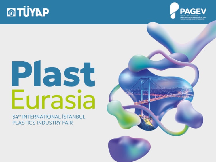
Colours and typography in the new identity
The new colour palette is based on two primary colours. Blue is intended to represent technology and trust, while green symbolises sustainability and a future-oriented approach. As emphasised, the combination of these two colours is meant to reinforce the main message of the new identity, expressed in the statement: "Technology and sustainability move forward side by side."
The refreshed identity also uses the Geologica typeface. According to the organisers, it gives the brand a contemporary character and at the same time is intended to symbolise evolution. The description states that the "Plast" element has been given stronger emphasis in order to underline the event's sector identity. In turn, "Eurasia" has been given a thinner, modern line, which is intended to reflect the fair's broad geographic scope and inclusive character.
Identity as part of a broader narrative
In presenting the new identity, the organisers stress that it is intended to serve as a visual expression of the industry's transformation story. In their view, it also reflects a brand vision that combines the aesthetics of the future with technology and sustainability. The statement notes that the refreshed identity is meant to demonstrate a production culture based on combining technological capabilities with a responsible approach to development.
As indicated, Plast Eurasia wants to be not only an observer of ongoing changes, but also their initiator. In this context, the new identity has been presented as part of the continued integration of innovation, the role of design and a future-oriented perspective within a single trade fair event.