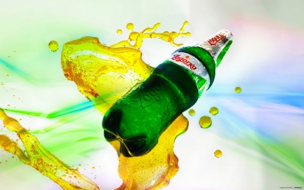
 Zagorka, part of the Heineken Group, is the heir of centuries of devotion to excellence of the big brewers, excellence to which was added a touch of originality that has enabled it to become the only "special" beer in Bulgaria.
Zagorka is the beer of a less ordinary taste characterized by a distinctive bitterness and a rich aroma, the result of the perfect balance of two different types of hops: these characteristics make it particularly appreciated by young people between 20 and 30 years who love to experience all that life can offer.
The brand therefore needed to associate a less ordinary taste to an equally distinctive packaging that would strengthen the shelf impact and allow to visually align the PET packaging of 1 and 2 liters to the smaller sizes of glass and aluminium.
The new design of Zagorka, developed by the Design Center of P.E.T. Engineering, gives the brand a more distinctly masculine connotation through a robust shape and the inclusion of two majestic lions on the body of the bottle, a metaphor for the pride of the Bulgarian people and a reference to the nation in which this special beer is brewed.
The labels located in the upper part of the container allow immediate recognition within a range of bottles that show large labels in the central part or thin ones in the lower one. The choice of placing the label on the top not only responds to the need for an aesthetic differentiation, but also to the desire of creating a packaging with an extensive grip, and therefore easy to handle.
Moreover, placing Zagorka's logo in the wide gripping area allows a continuous contact, including physical, between the brand and the consumer and makes consistent the image of PET packaging with those in glass and aluminum.

Once again P.E.T. Engineering has managed to combine both marketing and production demands through its combined concept design and engineering service.


